InDesgin Work
::Company Advertisement::

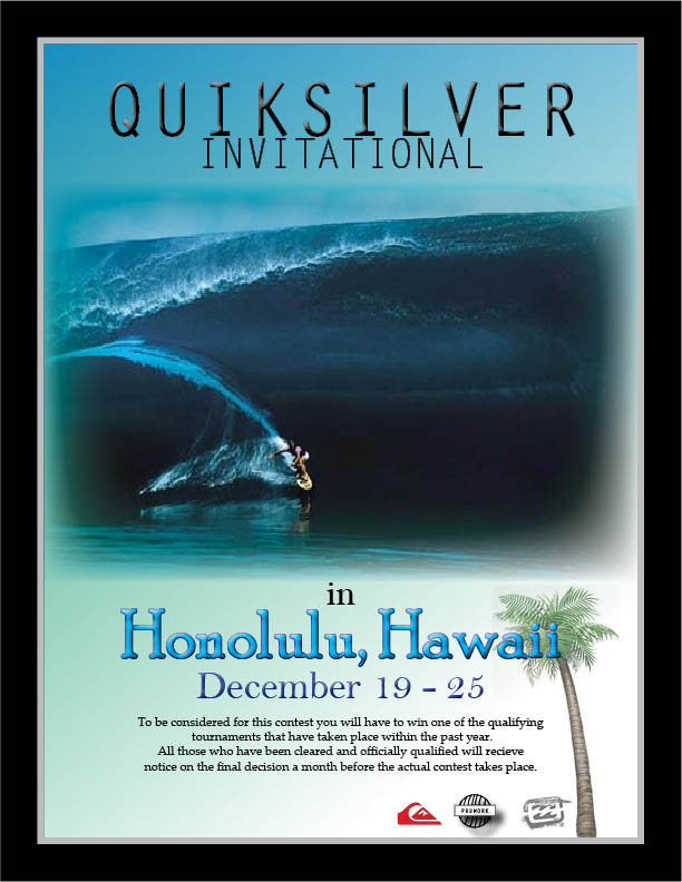
This was a business flyer that I had to create from scratch. It involved adding effects to the font, feathering, custom gradients, and pasting pictures into the frame. It was constricted to a specific size, which was the standard size of newsprint.
I started with the color scheme of the flyer. Since I had decided to do the flyer around a surf competition, it was fitting to try and keep the colors all natural blue/green with black. The text at the top was just a plain text that I embossed so that it would have a little more dimension to it. The picture is a classic one that I knew anyone who surfed could easily recognize and it would grab their attention. For the Honolulu, Hawaii text, I actually used a preset text style to add to the plain text.
By setting up layers I could move aournd all the different texts and images so that I could arrange them in an easy to read and organized manner. I did not want to go over the edge with this and make it chaotic in any way. The banner around the flyer helps to bring it all together.
::CD Cover & Back::


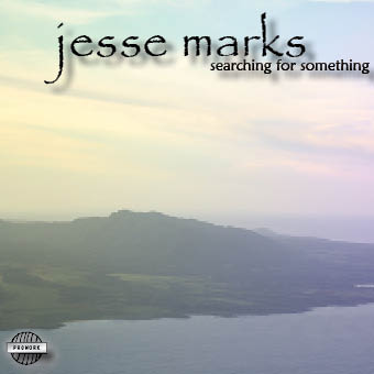
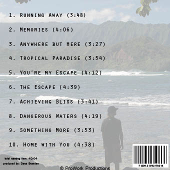
After thinking about all the possibilities of what to make for a CD cover or the type of music I wanted to convey, I decided on a simplistic theme so that it wouldn't overwhelm the buyer. It has the appearance of a laid-back style that could be paired with a country genre because of the names of all the songs. I wanted to keep them neat in appearance instead of placing them randomly throughout the back. I feel that the images that I selected as the background for the front and back were very fitting for the songs and title of the CD. There are minor effects done to the text, and editing was done to the images so that the text could be easily read.
Although there is not seemingly a lot of work that was done to the images, it does contain shadowing, glow, embossing as well as setting the text to the bottom of the text frame. Again, I did not want any kind of crazy scratchy text that would distract someone from actually reading the names of the songs and appeared as a well organized and thought out cover. Not something thrown together at random in just a few minutes.
The smaller qualities of this would have to be the proWork logo which was made from scratch, as well as the barcode so that a system could potentially scan it. These couple of additions give it a more real like feeling of a CD case.
::Fair Advertisement::

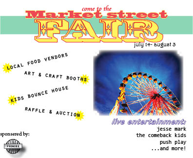
The advertisement for the Fair was actually a really fun and easy project that we had to do. It doesn't involve too much because it is constrained to such a small area, however there was a lot of effects and filters added to make it pop.
The image was just something I found on the internet that I thought that everyone would associate with a fair. I originally wanted to add another picture of possibly a family while at the fair, however with the spacing it would not have made the balance work out with what I had already done. I gave it a unique border using the stroke and then added a feather to the whole thing so that it would not stand as sharply against the white background.
The text for the fair was made with simple text editing by making a fill and stroke color. I decided not to emboss or do any other effects to it because the simple yet obnoxious color mix has always been associated with the fair. The text that involves the actual activities that will be going on were just tilted to a certain degree so that it looked more fun, but still remained balanced and organized.
Overall, I like the outcome of it. It is not one of my favorite works, but I think that it meets all the needs an AD for the fair would have.
